
Flexbox is one of the most useful features in CSS. In fact, it allows you to place content dynamically, and let it adapt to your page. This is invaluable, as users use many different devices. We want our website to look good on any type of device, from smartphones to PCs or smart TVs. In this CSS Flexbox tutorial, we will see just how to do that.
Since we are covering directly CSS Flexbox, you should have a general understanding of CSS already. If you don’t, you may want to start from the basics of CSS.
What is CSS Flexbox?
Before we dive into writing the code, we can spend a few words on what is CSS flexbox. CSS flexbox is an approach to creating a layout with CSS, not just a single CSS property. Indeed, we will have to use several properties to achieve what we want.
Flexbox is a way to position content that is dynamic and can readapt as the page is resized by the user.
Since flexbox is a way to position content, it will define where the content should appear on our page. It does that by defining where an element should appear, considering its parent and its siblings.
With flexbox, if the screen is not wide enough, you can make an element go on the next line. However, if the screen is wide enough instead, you can have two (or more) on the same line. You can also increase the size of an element based on the size of the page, and even achieve the highly desired vertical centering.

CSS Flexbox Tutorial
Parent & Children
To implement positioning with CSS flexbox, we cannot use a single element. In fact, we need to use at least two: one parent, and one (or more) child. This is crucial, because the positioning relies also on the parent, so we need to have a parent element.
Specifically, we define that all the children of the parent element will be positioned dynamically. In other words, only the children will readapt themselves to the page. Of course, you could nest one flexbox into another, but we will see that later.
For the sake of this CSS Flexbox Tutorial, we will work on the following HTML structure. The .container element will be the parent, and all other .box element will be the children.
<div class="container">
  <div class="box">1</div>
  <div class="box">2</div>
  <div class="box">3</div>
  <div class="box">4</div>
  <div class="box">5</div>
</div>
To make things clearer in our example, we can add some style to our boxes. This is totally optional, but will help you better understand how flexbox works.
.box {
  width: 200px;
  height: 200px;
  background-color: lightblue;
  font-size: 46;
  text-align: center;
  padding: 10px;
  box-sizing: border-box;
}
Display Flex
The lynchpin of flexbox is the property display: flex. We need to apply this property to the parent element, because it tells “place its children in a flexible way”.
You can clearly see the difference in how our HTML snippet is displayed. Without it, every .box element will be on its own line. However, as soon as you activate display: flex on .container, all .box elements will move to the same line. That’s because, by default, a flexible positioning will want to put everything on the same line.
.container {
  display: flex;
}
Yet, even now, if you try to resize your page all the boxes will always stay on the same line. That’s regardless of how small you try to make your window, they will always shrink and even go on top of each other in some cases. We clearly need something more.
Flex Wrap
The next property you want to be familiar with its flex-wrap. This property controls if and how elements can go onto a new line in case the space is scarce.
We have three options:
nowrap(the default) will never allow items to go onto a new line.wrapwill allow items to go onto a new line if there is no more space on a single line.wrap-reverseworks in the same way aswrap, but it will make go on the new line elements from first to last (and not starting from the end).
In most cases, you will either specify wrap or just omit the property altogether (because wrap-reverse is rarely used). At this point, to see the difference, we can add flex-wrap: wrap to our container.
Items will wrap when the width of the parent is not large enough. To see this in action, we have also applied a border to the container, so that its dimensions are visible. The total styling for .container is thus the following.
.container {
  border: 1px solid red;
  display: flex;
  flex-wrap: wrap;
}
Flex Direction
We know that, with CSS Flexbox, we can place items one next to the other, and go to the next line if needed. Well, we have even more control on how we place those elements. In fact, we can decide the direction to use for their placement (e.g. left to right, or right to left).
We do that with the flex-direction property, which can assume four values.
rowis the default, and places elements horizontally from left to right.row-reverseplaces elements horizontally, but from right to left.columnwill place elements vertically, top to bottom.column-reverseplaces elements vertically, but from bottom to top.
So, in this example, if we were to apply row-reverse, elements will be placed from right to left. So, on the first line, you would have 4, 3, 2, 1. And, on the second line, you would have only 5, but all the way to the right (because the starting point is on the right).
The direction defines also what the main axis is: horizontal or vertical. As you can imagine, for row and row-reverse it will be horizontal, while for column and column-reverse it will be vertical.
We don’t need to tweak with this property that much for now.
Justify Content
So far, we saw how to deal with scarcity of space, or what to do if we want our elements to go to the next line. What if there is more space than we need? Often, we may want to distribute our elements in some way.
With justify-content, we can decide how to arrange elements on each line when there is more space than we need. We can give different values to this property.
flex-startwill flock everything to the beginning of the flex-direction (e.g. left in case ofrow), and move from there accordingly. This is the default.flex-endis the opposite, will align everything to the end of the flex-direction.centerwill flock all the items at the center of the main axis, leaving empty space on the left and on the right.space-betweenwill place the available space between the elements. In other words, the first element will align to the flex-end, and the last element will align to the flex-end. All other items in between will be spaced evenly. This is generally the value you want to use more often.space-aroundwill add the same amount of spacing around every element, including the first one and the last one. As a result, those two will be shifted from the size of the container, something we rarely want.
To make things nicer, we can apply justify-content: space-between to our container. Now, all its CSS properties look something like this:
.container {
  border: 1px solid red;
  display: flex;
  flex-wrap: wrap;
  justify-content: space-between;
}
Flex Grow
Another popular feature of CSS Flexbox that we explore in this tutorial, is the possibility to grow. To put it simply, elements can grow in size to leverage more space, if they have it.
We can achieve that with the flex-grow property, which accepts a number. Unlike all other flex properties we have seen so far, however, flex-grow applies to the child element. That’s because each individual child element may grow in a different way.
It’s all about proportions now. In fact, for each element you specify how much it should grow in proportion to the others. In our example, we may do something like this:
.box {
  flex-grow: 1;
}

.box:first-child {
  flex-grow: 3;
}
With this code, for all the boxes (.box) we set the flex-grow: 1, which means they will grow all in the same manner. However, only for the very first box (.box:first-child), we set flex-grow: 3. This means this box will attempt to grow tree times in size (on the flex-direction) than the other boxes if there is space to do so.
This will give all the items the possibility to grow (unlike the default flex-grow: 0). However, the only item that will have space to do it is going to be the last, and that will grow to occupy the entire line. If we remove the fourth and fifth element, we will see that only the first element is growing to take up more space on the first line.
Flex Shrink
As you can imagine, flex-shrink is the opposite of flex-grow. Even if not that common, we will still see what this property does as part of our CSS tutorial on flexbox.
Just like flex-grow, flex-shrink applies to the child element and accepts a number. This number tells how much the element can shrink, relative to others. You generally want to use shrink when, for some reasons, you don’t want to use flex-wrap. A good example could be how to arrange icons on a menu that must strictly be on one line.
Vertical Center with CSS Flexbox
One of the most desired yet sometimes hard to achieve results of CSS is to center items vertically. Yes, having something at the exact middle of the page (or in the middle of something else).
We can achieve this by nesting two flexboxes. However, to do that, there is one major constraint: the parent must have a definite height. It can be in pixels, em, viewport height, or even percentage if the ancestor has a definite height. Keeping this in mind, we can apply the following approach.
<div class="outer">
  <div class="inner">
    <div class="box">
      This will appear at the center of the page
    </div>
  </div>
</div>
We will use the .outer box to center the .inner box horizontally. Then, we will use the .inner box to center .box vertically. That’s pretty easy to do with CSS.
.outer {
  display: flex;
  height: 100vh;
  width: 100%;
  justify-content: center;
}

.inner {
  display: flex;
  flex-direction: column;
  justify-content: center;
}
Note that the outer container has a specific height, set to the full height of the browser. Obviously, to better see this in action, you can apply some style to each of the three elements.
Flexbox for Full Stack Developers
If you want to be a Full Stack Developer, you must know how to use flexbox in CSS. And, like any other technical skill, the best way to get it is by practicing. That’s why we are running ths free Full Stack Developer course where you can learn and practice all the skills you need. This CSS tutorial on flexbox is part of the course, so you get some exercise to try.
Note: we are working on a project already built from previous tutorials. If you haven’t started yet, you should begin here.
As part of this CSS Flexbox tutorial, you should realize a product showcase on the index page, where each product has a width of 300px but could grow to fill the space if needed. Each product should have a picture and a name, and in case of mobile devices, the products must be able to readapt to be one per line. The result we are looking for is something like this.
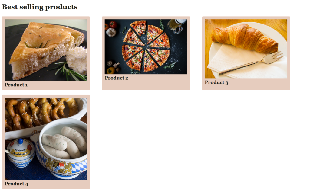
(If you need the pictures, we took those from Wikipedia: Product 1, Product 2, Product 3, Product 4).
As always, try to reproduce a similar setup on your own before checking the solution below. Once you are ready, you can look at the code below or check it out on GitHub. On GitHub, you can see the full repository at alessandromaggio/full-stack-course, or just look at this commit for the changes made in this very tutorial.
First, we need to add some HTML elements in our index.html (at the end of the body).
<h2>Best selling products</h2>
<div class="product-showcase">
  <div class="product">
    <img src="/assets/prod-1.jpg" alt="Product 1">
    <h4>Product 1</h4>
  </div>
  <div class="product">
    <img src="/assets/prod-2.jpg" alt="Product 2">
    <h4>Product 2</h4>
  </div>
  <div class="product">
    <img src="/assets/prod-3.jpg" alt="Product 3">
    <h4>Product 3</h4>
  </div>
  <div class="product">
    <img src="/assets/prod-4.jpg" alt="Product 4">
    <h4>Product 4</h4>
  </div>
</div>
And then, we can style it with the following CSS.
.product-showcase {
  width: 100%;
  display: flex;
  flex-wrap: wrap;
  justify-content: space-between;
}

.product {
  background-color: #E6CCBE;
  border-radius: 0.2em;
  padding: 0.6rem;
  width: 300px;
  margin-bottom: 1em;
}

.product > img {
  width: 100%;
}

.product h4 {
  margin: 0;
  padding: 0;
}
In Conclusion
In this tutorial, we saw one of the most crucial features of CSS: Flexbox. With it, you can place items dynamically around the page and readapt them on different devices. In fact, with this property we can achieve amazing results that were simply not possible before.
An extra bonus: before flexbox was created, developers used the “float” property to achieve similar results, but it was just a mess and brought many more complexities into the scene. Just know that in case you see it around.